Introducing the New GoSolo Invoice Design
We recently did a review of our Invoices and decided that they are so “2020”. To make them fit for 2021, we completely refreshed their design and the way they work.
There were a couple of issues with the previous version of the Invoices:
-
They didn’t have the most mobile-friendly user experience: the invoice would open but it would be hard to read the details of it
-
It was difficult to see the actions required for the Invoice and make a payment for the Invoice
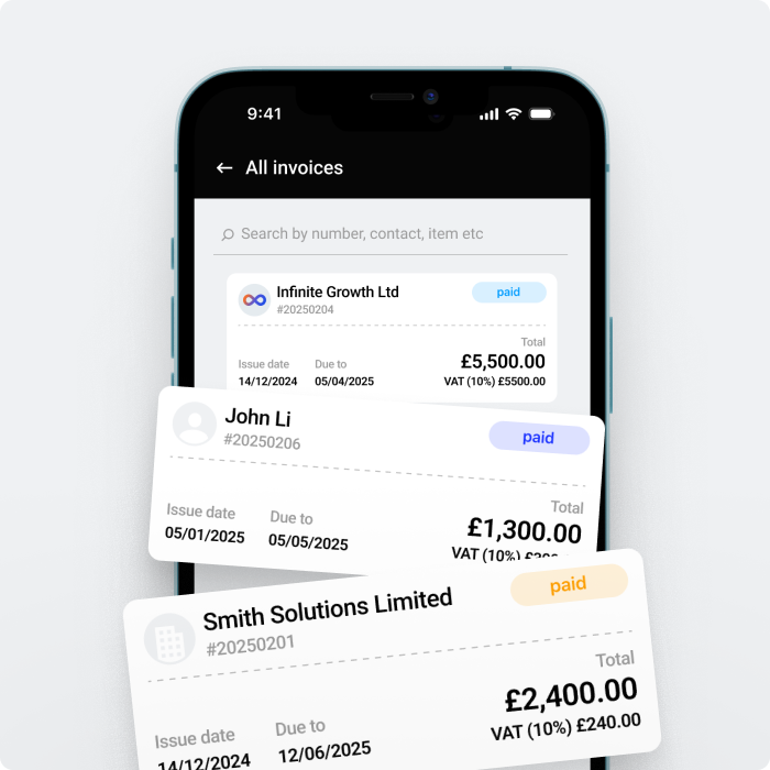
So we made some changes to the layout. As a GoSolo user, you may not notice a lot of changes, however, the changes are visible when your customers receive a GoSolo invoice. New interface makes it much easier to view all the necessary invoice details and complete required actions:
-
It is now possible to view all the high-level and most important details such as total amount, who the invoice is from, to whom the invoice was sent, bank account details straight away
-
User can copy paste account and reference information more easily in order to make a payment, instead of picking out this information from the invoice itself
-
If a user needs to see more details about the Invoice and what items are included, they can drill down into each individual item separately
-
User can also download a pdf copy of the invoice as they could do so before this change
The update is now live and can be used straight away. There is also something special in the works, which we can’t wait to show you, related to how invoices get paid. Keep an eye out for more updates from us in the coming weeks!
P.S. We didn’t forget the Mobile App – we’re running final checks now so that you get a smooth overall experience when you finally get it. The launch is planned to take place next week (w/k 14/06).
Available on Web, iOS, and Android.


 Back to Blog
